RETHINKING STYLE GUIDES
FOR GLOBAL BRANDS' DIGITAL TRANSFORMATION IN THE AGE OF DEGLOBALIZATION
Featuring a three-year case study with Greenpeace
Asli Sonceley & Team
04.04.2017

The task with Save the Arctic Style Guide was to create the tools for one campaign for one region with eyes on it from all over the world.
With Forests initiatives, we worked with the five largest forest regions of the world. Many more regions on the map and many more eyes on them.
Suddenly, it's a different process.
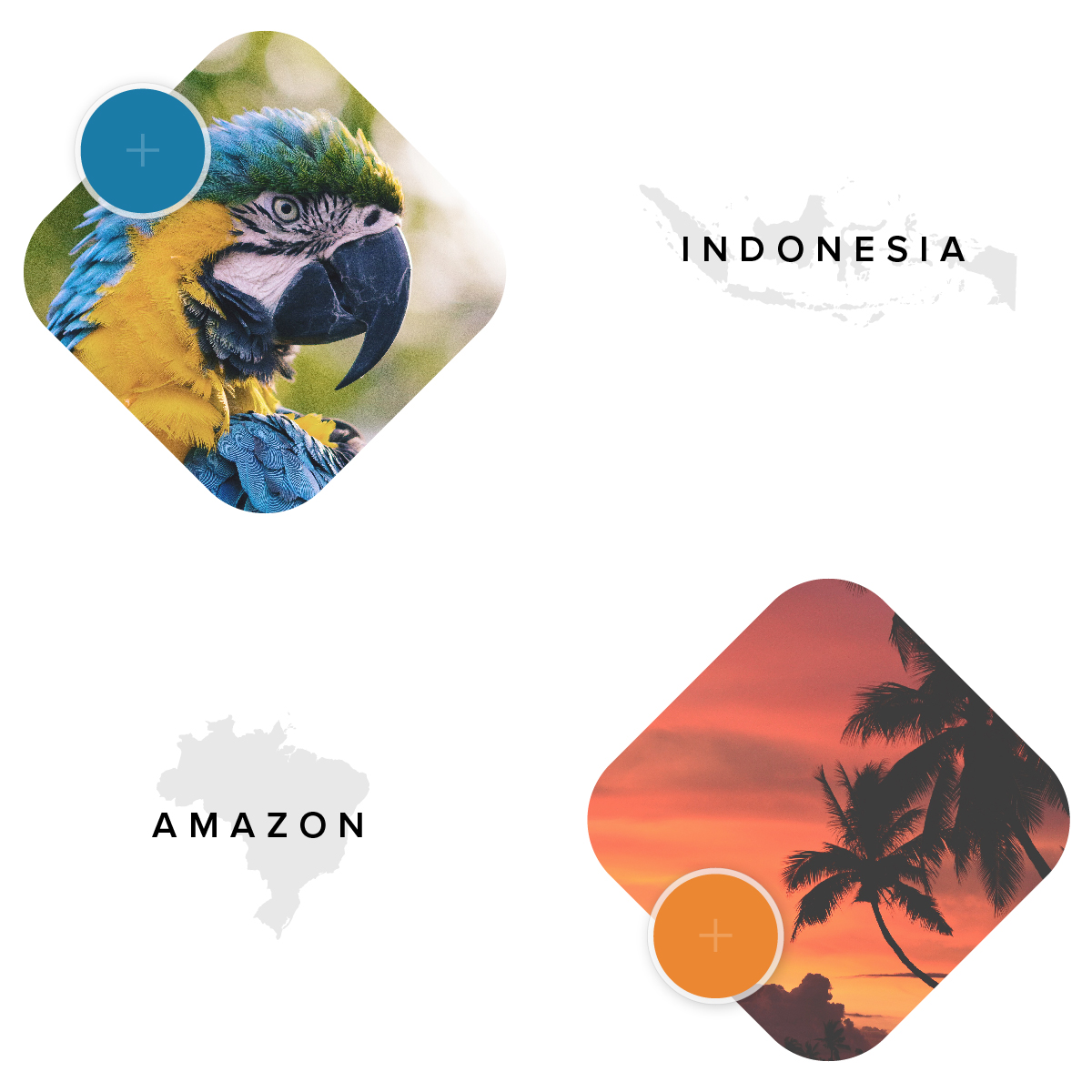
Among global environmental initiatives, defending the forests is one of the oldest ongoing battles. Throughout its history, Greenpeace has launched campaigns across the five major forest regions: Amazon, Indonesia, African Congo Basin, Russia and Canadian Boreal. Though they have recorded success in this arena, the threats of deforestation remain on the rise in critical regions.
“Stand For Forests” is Greenpeace’s global program to bring new energy and fresh eyes to the topic. With this objective in the center, Sr. Campaign Strategist Graziela Tanaka and Sr. Engagement Advisor Pete Speller initiated a rebranding project for Forests. They intended for the style guide to interlink the different regions’ campaigns under a unified visual identity, and amplify the message with visual consistency.
Same principles as the Save the Arctic Style Guide apply here: empower internal GP teams, as well as external stakeholders with the necessary visual components to launch campaigns effectively. But Forests come with a unique set of challenges.

A conversation with Greenpeace’s Global Campaign Leader Matt Daggett blew our mind open to the deeper realities the organization deals with. Activists often battle against time, government restrictions, and even counter-PR. Our team spoke with NROs in Brazil, Indonesia, Netherlands, Canada, Germany, and Africa. We learned how campaign messaging can drastically change between market countries and local initiatives.
Each forest region is home to specific flora, wildlife and indigenous communities. Every region is subject to a unique threat. Framing campaigns requires speaking the language of forest nations, a deep sensitivity towards these cultures, and understanding the laws and regulations of different governments.
Activists apply a range of methods to get their message across: from deep research and quiet diplomacy, to direct action. This means many petitions launched, websites designed, and social media posts created.
Greenpeace’s existing audience of 2.8 million people already provide their continuous support. But reaching the younger generation of supporters is the organization’s next frontier. Our objective here was to create not only a visually impressive identity from the ground up, but to provide a guide to empower a growing movement surrounding the forest issues.
A MODULAR & FLEXIBLE DESIGN SYSTEM
Aiming to stand out amid the noise of social feeds and to distinguish the campaign from similar non-profit messaging, Art Director Omer Avarkan employed the attitude and visuals we see trending on album covers, movie posters, magazine spreads and vanity graphics. A separate design study will elaborate on the style choices and themes (poetry, solidarity, sublime geometry) that drove the visual inspiration.
The core driver of our design choices was once again the users’ experience. Knowing that each campaign, each region, will eventually pursue a unique tone, we wanted to create a canvas to comfortably work upon. A flexible, modular system that connects all of the campaigns together, while leaving room for them to adapt, mold, and take shape in limitless ways, embracing the local nuances and creativity.
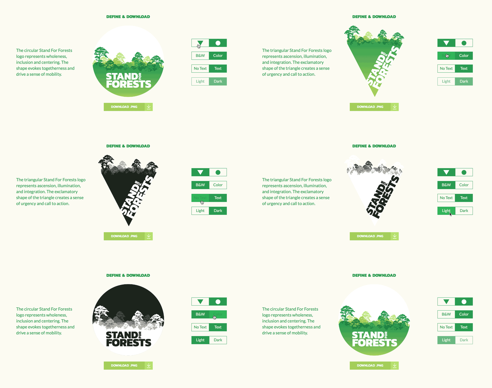
Omer Avarkan designed the logo system and its applications. The logo mark is a container, serving as a vessel, and transforming with a new narrative every time. This modular and dynamic visual system is comprised of simple, flexible shapes and forms that can be layered and combined for buildable complexity. This opens up room for unlimited possibilities. Seasoned and novice designers can quickly create a simple social media post. Design agencies can tap into the guide to create more elaborate applications.
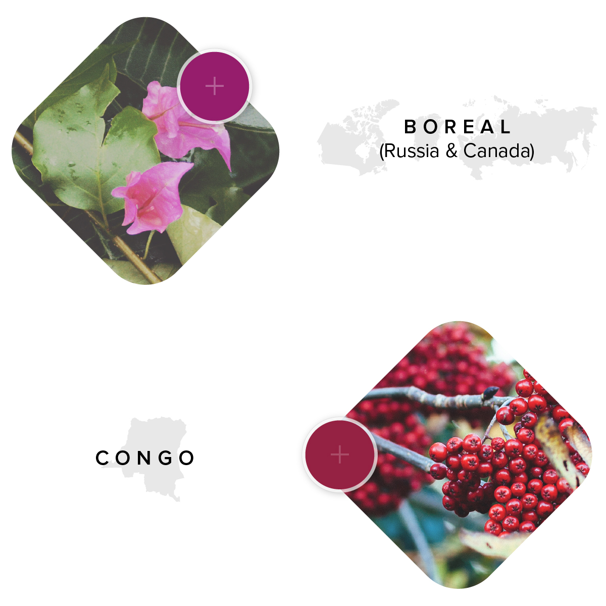
Flexible branding is of course not a completely novel concept. But creating a process for diversified brand stakeholders is a brand new challenge. In the new style guide, each chapter showcases regional specific elements and logos that hint unlimited possibilities to create more localized campaigns.
The style guide, as a product, is an even more interactive tool this time. In the logo section, users are able toggle between different shapes, silhouettes and text applications of the logo mark. They can then download their logo in a variety of formats. Templates offer an array of layouts for various applications. Photoshop, Illustrator files, GIFs, example mockups provide inspiration and guidance on how to apply this new visual language.

Since its launch in 2016, real life applications of the Stand For Forests Style Guide have appeared online.
Aimed to raise awareness of forest fires, Greenpeace Indonesia embraced a flaming crimson red in their design applications. They utilized the geometric shapes and layouts in their web layouts.


[THE GREAT NORTHERN FOREST]
The Great Northern Forest campaign is a multinational initiative to protect the “crown of the planet.” Over twenty countries including Canada, Russia, Greenland, Norway, Finland, Belgium, Denmark are participating in the campaign with a united voice and visual language while staying true to their regional nuances. Great Northern Forests claimed the boreal silhouette of the logo mark, as well as snow white, mud grays, accented with the reds of the northern sunset.
We joined the Greenpeace team again on this one to launch a petition design and develop a simple, easy to use, adjustable template to assist the individual offices that lack the bandwidth to create their own petitions. Our collaboration with the Engaging Networks platform bears a separate discussion around further integration of digital products into the campaigning process.


