RETHINKING STYLE GUIDES
FOR GLOBAL BRANDS' DIGITAL TRANSFORMATION IN THE AGE OF DEGLOBALIZATION
Featuring a three-year case study with Greenpeace
Asli Sonceley & Team
04.04.2017
OCEAN IS
▼
Two years since the Save the Arctic campaign, interactive style guides have become common practice for GP communication offices. The last in this series is another big undertaking, now for the Oceans of the world.

In many ways, the Oceans project is similar to Stand For Forests. Both style guides are meant to unify siloed projects with a consistent and flexible visual identity.
Historically ocean initiatives represent an origins story. Today, Greenpeace campaigns cover the globe from the Arctic to Australia over a wide range of threats against ocean life and communities. Whether it’s promoting sustainable fishing practices or fighting for coral reefs, the goal is to transform the public's mindset about restoring a healthy and thriving ocean.
A FLUID CAMPAIGN CONCEPT
Many non-profit organizations, campaign names or slogans feature a clear action to “save” “defend” “protect” or “stand for” the campaign goals. However we have seen that campaigns are launched for unique initiatives, thus their slogans and calls to action will always change.
Save The Arctic ➞ The Arctic Home
Stand For Forests ➞ The Heart of Amazon

For that reason, we chose to set the overarching campaign concept as something that will be applicable to many cases. Our designer Kristen Abercrombie envisioned an adaptable concept that can apply to current and future campaigns, allowing campaigners to shed light on particular aspects and characteristics of the Ocean.
"Ocean is” allows campaigners to frame the ocean in different ways depending on the purpose of their campaigns. “Ocean is home” frames it as a habitat for many living creatures. “Ocean is life” points to real communities who depend on the Ocean for their survival. Other frames are applicable to create urgency, or inspire action to defend the oceans.

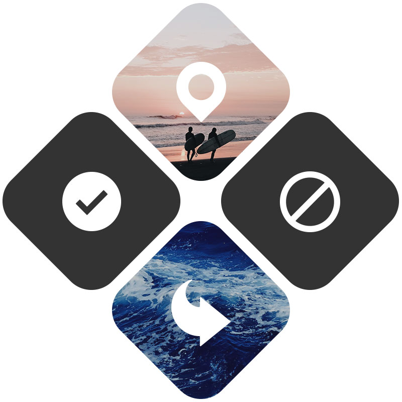
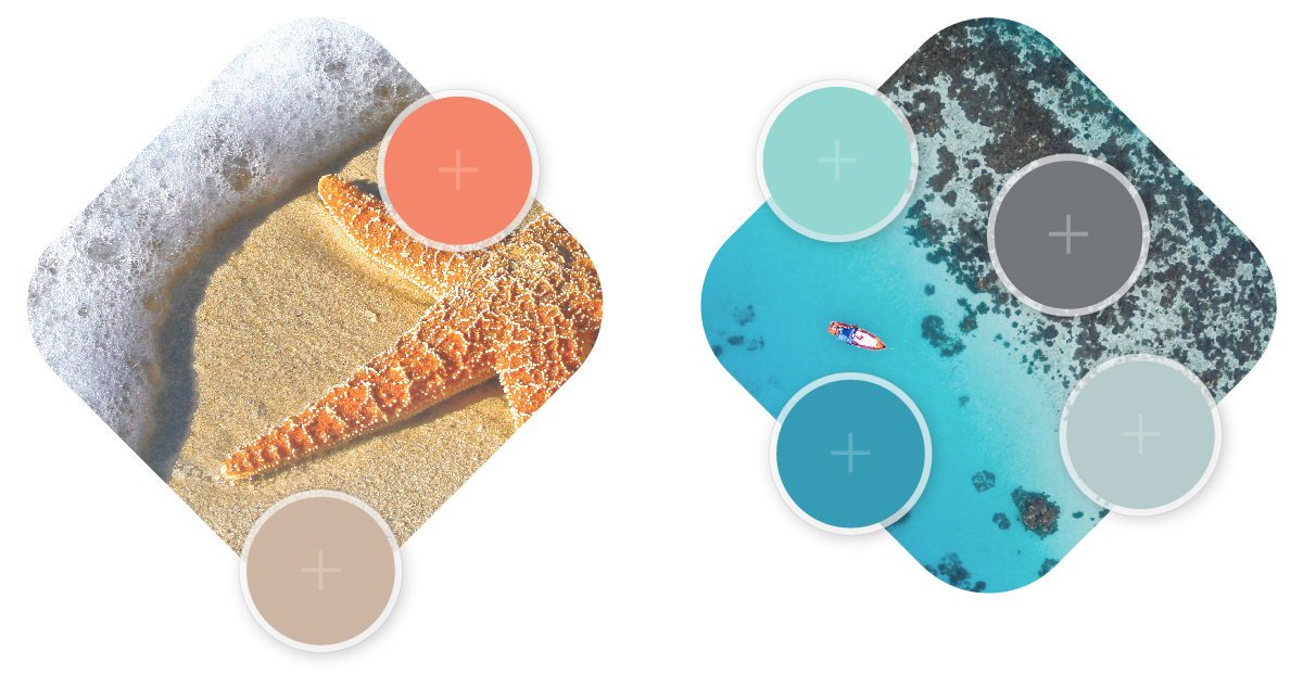
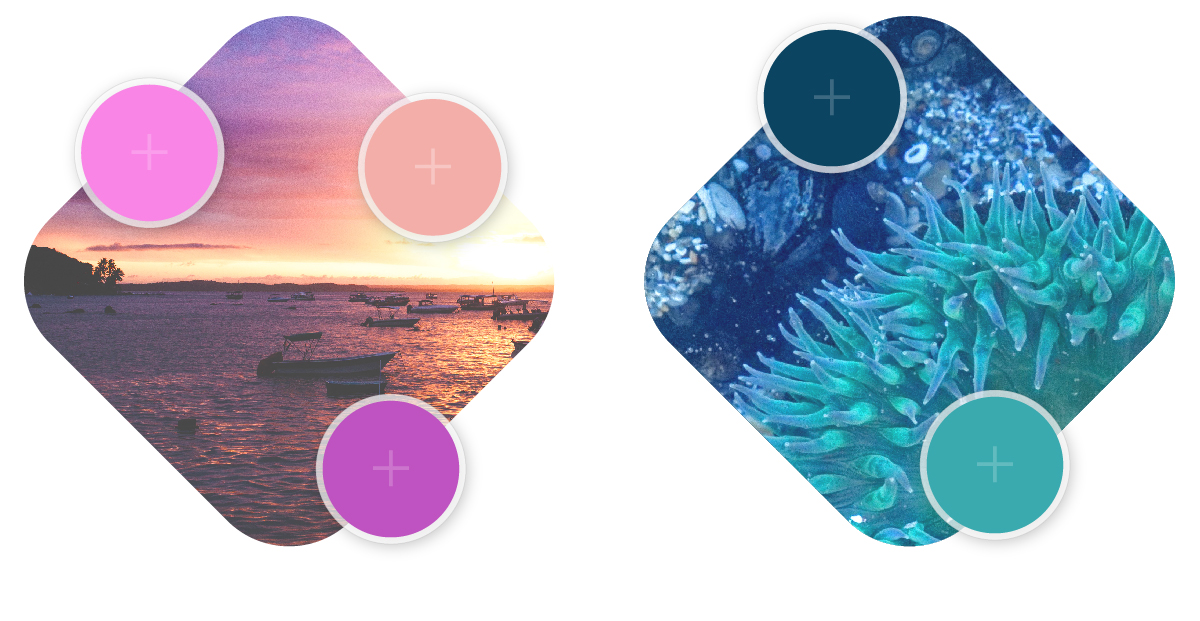
In this visual language, the logo shape is imagined to become interchangeable with various framings of “ocean is” when used in different contexts. Once again campaign identity here is a modular system of simple visual components that can be implemented in flexible ways; from very simple layouts to more complex graphic treatments. The interactive style guide is complete with downloadable assets, templates, and flexible applications of the visual system with the logo, graphic shapes, iconography, color gradients and typography.
THE NEXT ITERATION:
VISUAL & LINGUISTIC STYLE GUIDE
One important addition to this style guide is the linguistic research Greenpeace Australia commissioned. Director of Special Projects Tom Allen asserts the importance of the “many to many” approach in campaign communications - as opposed to “one to many.” More and more people become brand stakeholders, and speak on behalf of the campaign. The linguistic guide looks into the ideal ways of framing the oceans narrative, based on research and analysis of English speaking nations’ perception of the oceans. This research sets a precedent for other local regions and other languages to conduct the same type of exercise, suggest do’s and don’ts, and address cultural sensitivities effectively during their campaigns.

Ocean Is Style Guide launched in 2017. We have started seeing early applications in social media such as @peopleoftheoceans Instagram handle. Greenpeace Africa's most recent campaign on sustainable fishing Hope in West Africa is currently live.

Style Guides Connect The Chapters of the Brand Story
Style Guides Solve Process Problems for Siloed Teams
What's in The Future?
Evolved Style Guides
The Age of The Bottom Up Brand
